A peek into the mind of an aspiring interior decorator and designer.
By Aiden Jewelle Gonzales
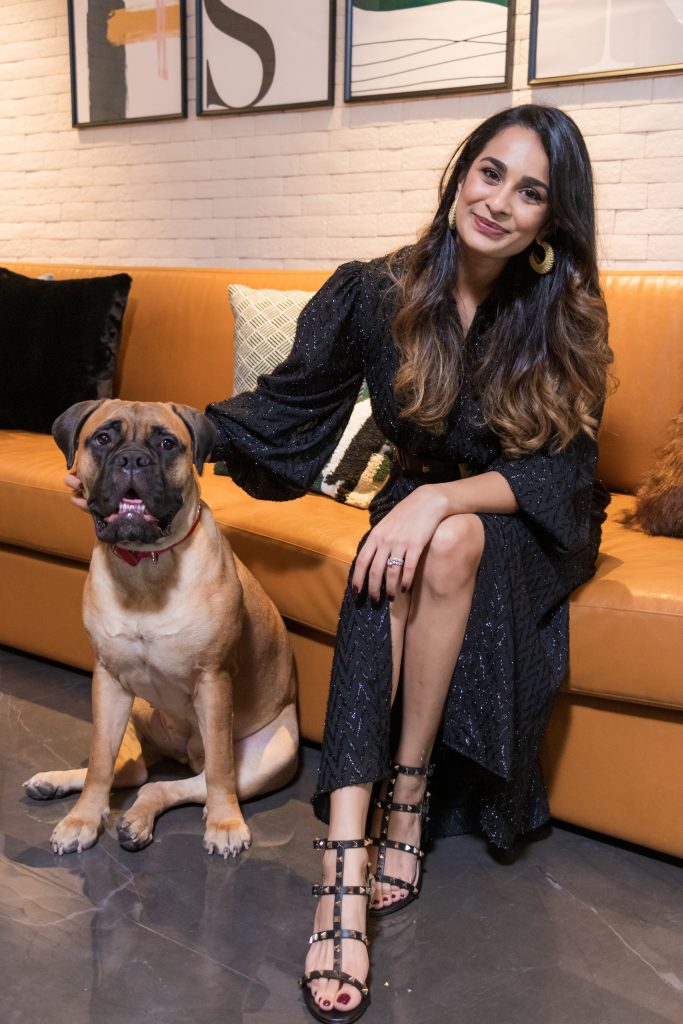
Sometimes when you shoot for the moon, you’ll land in your own castle in the sky. Such was the case when aspiring interior designer Namrata Kacholia Mahansaria turned what was once a pipe dream into a carefully-considered reality, pipes and all. Born and raised in India and formerly a management consultant in Mumbai, Namrata didn’t realise her true calling until after her post-wedding move to Thailand last year.
“When I walked into this apartment in 2018, it was an empty shell with workers and rubble everywhere,” she tells me, indicating the newly-renovated space, which belies her words with its gleaming fixtures and tasteful elegance. “My in-laws had decided to surprise me with my future home, and I remember sobbing when they told me I could design it any way I liked. I didn’t know it then, but that was the day my official love affair with interior designing and decorating began. I’ve realised through this project that they blend together my interests and my strengths: creativity, human psyche, and design.”
Indeed, the entire home was a labour of love from top to bottom – literally, from the raised ceilings to the sophisticated black marble flooring. “Everything you see around you was part of the scope,” Namrata says, as she walks me through both her apartment and her process. “Once the overall layout was complete, I moved towards furnishing it, coming up with a vision for each room and then finding the right stores in the city to source items from. A lot of the furniture is custom-made as per my design and styling ideas, which was one of the project’s highlights.”
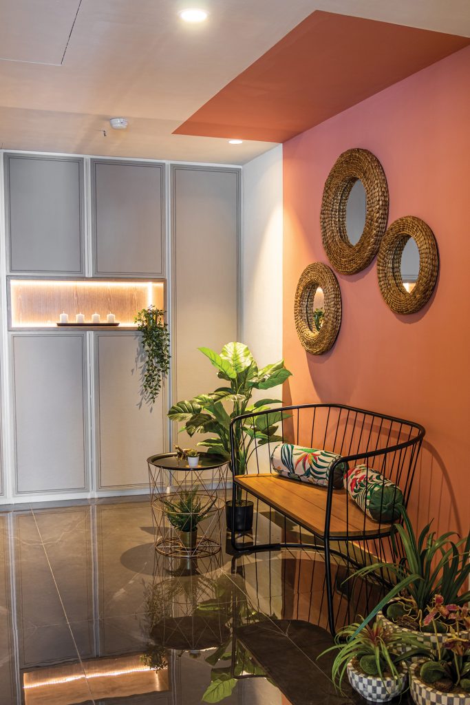
As we move through the clearly-distinct spaces, I ask her about the vision and inspiration behind each of the rooms. “It’s interesting how that works,” she says with a smile. “Anything can serve as inspiration, whether it be a piece of art, the purpose of the room, or simply a colour scheme. Take this foyer, for example.” The first thing guests see when they enter, it’s suitably striking, care of a salmon-coloured slice of wall that partly extends into the ceiling, drawing the eye up. Grey-panelled storage space and greenery offset the bold colour, while a trio of mirrors breaks up the wall, so the space is simultaneously impactful and inviting.
“The foyer needed to reflect how I’ve played around with colours and styles within the house, so I chose these colours,” Namrata explains. “A big inspiration was designer Kelly Wearstler, who’s one of the most reputed interior designers in the U.S. Her explanation of the delicate relationship between colours, and the synergy created by combining different textures, helped me look at the house in a whole new light.”
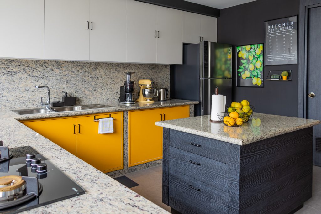
This mix of colours can be seen more clearly in the kitchen, a sprawling space with plenty of natural lighting to balance out the contemporary black walls and kitchen island. “Many people shy away from having shades like greys, browns or blacks on their walls for fear of creating a sombre atmosphere,” Namrata points out, “but when done right, greys are warm, browns are soothing, and black is beautiful. Dark interiors tend to cocoon you, all while adding a bit of glam and mystery. The use of dark hues was recently thrown into the limelight by U.K.-based designer Abigail Ahern, another of my main inspirations, and you’ll be able to see her unique style echoed around the house.” However, the kitchen still had pops of colour in the form of mango-yellow cupboards under the generous counter tops. “They’re necessary to add a little life to the room, as well as much-needed storage. Plus, yellow makes everyone happy!”
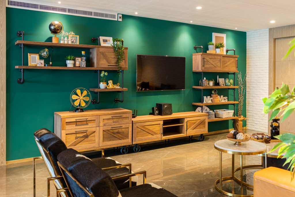
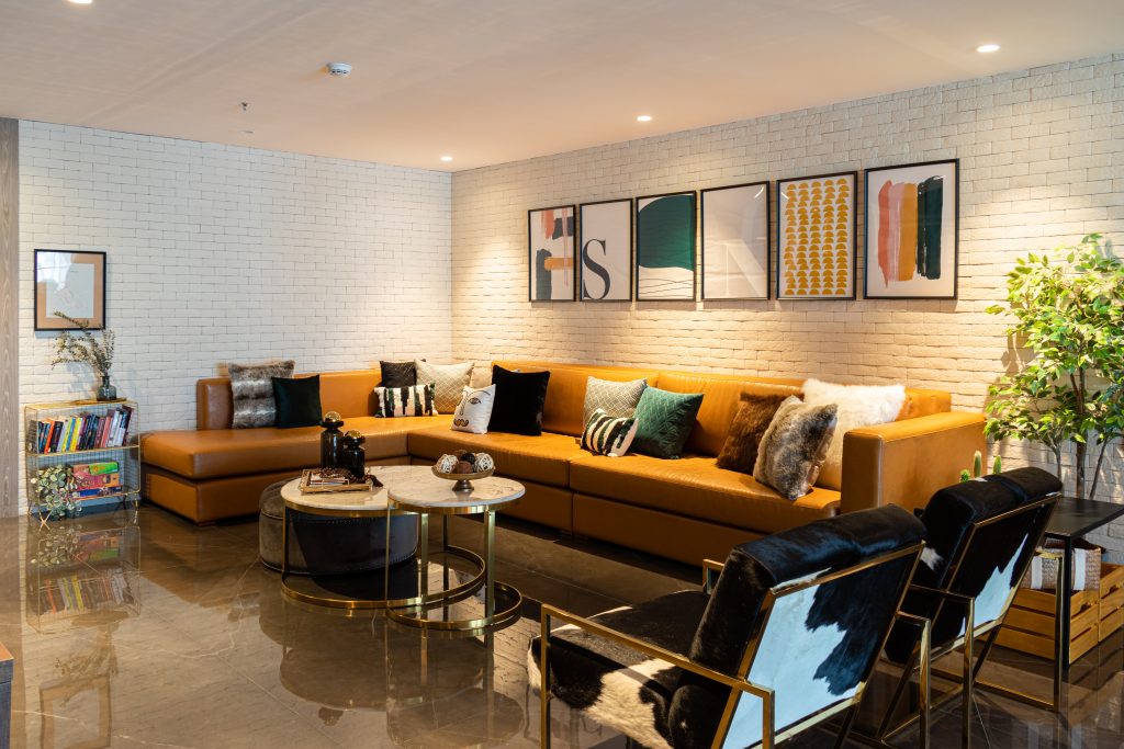
“Drawing inspiration from both those designers is how I was able to go big and bold, while maintaining the softness needed to create a cosy, liveable home,” Namrata continues, as we move on to the living room, which is dominated by an ochre leather couch of magnificent proportions, set against a backdrop of white brick. “For example, here, it was important for me to create a space that looked like a couple’s house, with both a masculine and feminine touch. To that end, I paired industrial design, a style I’ve always been a fan of, with gold furnishings and different textures.” The industrial-chic elements can be seen in the exposed piping of the shelves by a forest-green wall, as well as in the lighting over the carved wood dining table. The gold elements come into play in the furnishings, as well as the bar that immediately caught my eye when I walked in; a construction of artistry that would make any Bangkok rooftop proud.
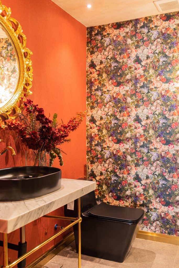
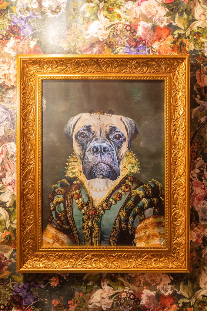
The powder room attached to the living room was a charming surprise in the form of Victorian wallpaper and vintage-style lighting that illuminated a captivating portrait of a bull-mastiff in Renaissance-era clothing. “This was actually the last room in the house that I designed,” Namrata reveals. “Funnily enough, the design choice came from a similar pet portrait I’d come across earlier, which I knew I wanted to get done for my soon-to-be pet Lana, and that served to inspire the whole room.”
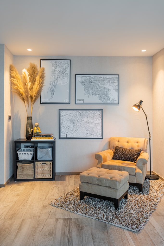
On the other side of the house is an activity room in neutral tones with custom-ordered maps on the walls; a soothing Scandinavian-esque move away from the other rooms’ dynamism. “It’s a spare bedroom that serves as an office, gym, and occasionally a space to relax in, so I went for whites, creams, greys, and blacks to create that vibe,” Namrata explains, “while the bohemian décor is there to break away from the sternness of the colour scheme.”
Meanwhile, the master bedroom is, in Namrata’s own words, “the room I want to feel most comfortable in.” This is evinced by her choice of warm shades and wealth of textures, from the sheepskin throw, to the woven rug in innovative use on the wall, to the hanging planters. “As a child, I realised early on how much impact colour, décor or lighting can have on a person’s mood. Earthy tones tend to relax, and so I added a rust-brown headboard in the bedroom. To further that feeling, I chose bohemian décor, which pairs with this colour palette, as well as enough lamps to fully light up the room.” Pointing out the inviting profusion of throw and sham pillows on the bed, she adds with a laugh, “An additional tip: throw pillows and blankets always do the trick!”
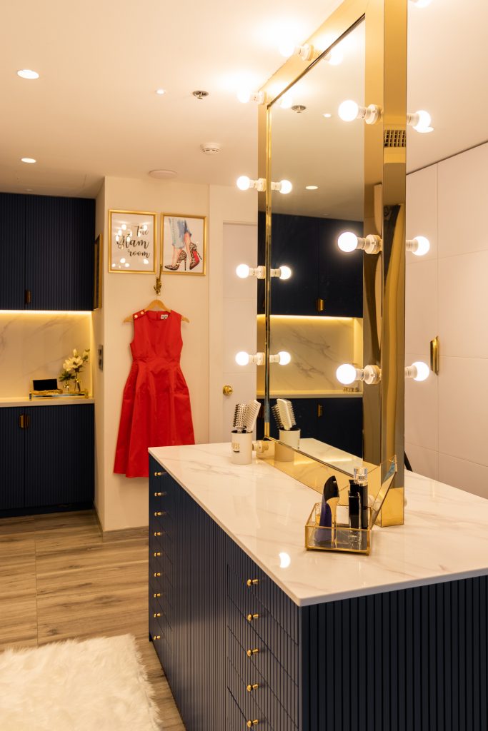
Adjoining the bedroom is a walk-in closet and dressing room in white and royal blue which, as a fellow clotheshorse, took my breath away. “With my interest in makeup and fashion, this room is more personal to me than my husband, and that proved tricky to design as I wanted a dream-worthy closet that was also useable for both of us.” In pride of place is a Hollywood-style mirror bordered by sizable light bulbs, the only element Namrata reveals she was initially sure of. “In the end, I balanced out the traditional layout and furniture with the colour, which adds flair, and a more feminine vibe through the art prints.”
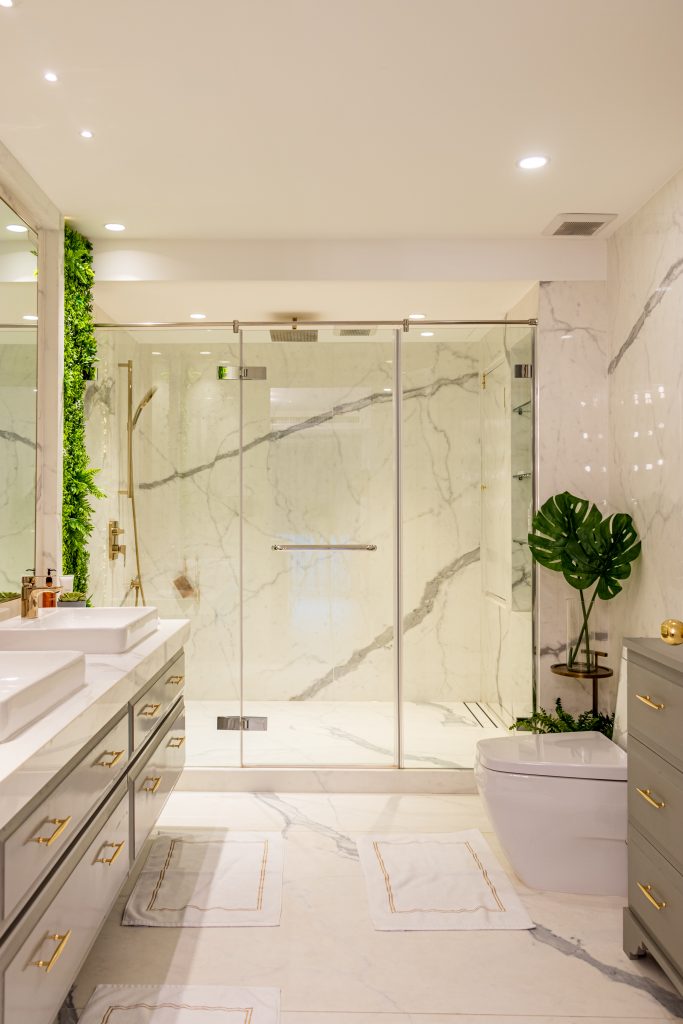
Finally, the ensuite is classic in marble and gold, broken up by recessed lighting behind faux-plants and cheeky frames of animals’ backsides. “Both my husband and I love hotel-style bathrooms, and nothing says classy like sleek white marble with grey and gold fixtures,” says Namrata.
Overall, although each section of the house has its own distinct point of view, I found that the spaces seamlessly flow into each other, and Namrata agrees when I mention this. “I don’t think I could classify the house’s aesthetic or my personal style into any one particular category. Rather, they’re a fusion of styles that I think look good when combined. Each room has its own energy based on its functionality but even with all the differences, there is a smooth continuity of décor style and colours throughout the house and that’s what ties it together – for example, the colour blocking in the foyer is followed by colour blocking in the kitchen, while greenery and bohemian touches continue throughout. To create flow, certain elements from the previous section need to make it into the space ahead.”
As for advice to other aspiring designers or those simply wanting to change things up? “I think the most important thing is to balance practicality, personality and design. For example, I love to host, so I knew I needed a big enough space to accommodate people comfortably, and thus I got a massive sofa. Marrying these three factors will give you a space that not only looks beautiful, but enables you to live without compromise on any one front.”


